I sometimes get an idea in my head, and become a little obsessed with that idea until I attain or obtain exactly what I'm looking for. Lately, this idea is a funky and colorful (but not overly loud) adornment for my hair at our reception.
I'll be wearing a veil for the ceremony and photos, but I'd like to add a little bit of fun hair-flair for the reception. I have found flowers and crystals and feathers (oh, my!), but nothing has yet tickled my fancy.
While doing my nightly wedding blog reading last night, I came across a possible solution to my hair-flair search. Lynn at Handcrafted posted about some adorable flower brooch's from Piper Ewan's Etsy shop. They are exactly what I have been picturing! Just look at how fabulous these are:
Designer Kirsten Moore says she will take special orders if you ask nicely :-) Her prices are extremely reasonable for such beautiful hand-crafted creations, and she also has some funky, unique garters on her site. I think I am going to have to figure out exactly what I want my hair-flair to look like and have Kirsten make me a Piper Ewan original!
Has anyone else been searching for a unique accessory that they can't quite find just yet? Maybe the hive can lend you a hand!
Thursday, January 31, 2008
Wednesday, January 30, 2008
Creating a Wedding Website with iWeb
Although I am a graphic designer, I focused on print design in college and never took any classes in web design. I missed the boat when it comes to html, Flash, Dreamweaver, etc. I've been wanting to learn, but haven't exactly gotten around to it.
When it came to creating a wedding website, I knew that this was something I wanted Mr. Cupcake and I to have, but I didn't know where to begin. I wanted something more than what The Knot has to offer, but I wasn't thrilled with all of the template options out there. Either the designs weren't customizable enough or representative of my taste, or the prices were ridiculous. The main purpose of having a wedding website was to be a source of information for our guests, but was it too much to ask to have it look cute without putting a dent in my bank account? I knew I could put something together on my own, I just had to figure out how.
Enter iWeb. (Insert the sound of angels singing.) This handy Mac program was included with my MacBook Pro, and it is as fool-proof as they come. It took me a few evenings of tinkering with the features and pre-made templates to figure out how to create my own design template, but once I did it was super simple. Below is the step-by-step of how I did it, and hopefully it will help some of you create your own fabulous wedding website!
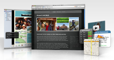
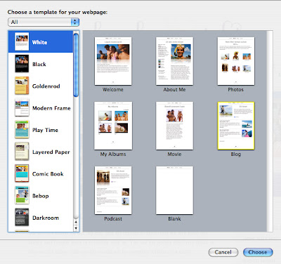
1. Open iWeb and choose a template
iWeb has several design templates to choose from. If you find one that is totally "you", you're in luck. I, on the other hand, tend to make things difficult for myself, and I wanted to create my own template. I began with the simple "White" template, beginning with the "Welcome" page, but deleted all of the components so I could place my own elements on the page. This is what took me the longest, because I knew that I would be duplicating this page as the base for all of the other pages, so I wanted everything to look perfect before moving on.
It is a great idea to do some sketches or have a rough idea of what you want your website to look like before you begin, so you can organize your steps accordingly, instead of just putzing around for several hours like me :-)
2. Start designing your home page.
To place your own elements, you need to make sure that the Inspector is open (click on the Inspector button on the bottom right of your layout).
If you want to insert blocks of color to anchor your design, you can begin with the "shapes" button in the toolbar at the bottom of your layout.
Click on the shape you would like to insert, and it will pop up on your layout. Using your inspector, click on the "graphic inspector" button to change the fill color, add an outline/stroke, shadow, etc.
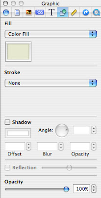
You will also need to use the "colors" button in the toolbar to customize the color you would like to use, and use your mouse to move the shape or adjust the size.
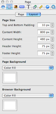
(You can also use the "page inspector > layout" button to customize the width of your layout, add a page background color, and a browser background color, if you so wish. And make sure to SAVE SAVE SAVE as you go!!)
The same rules go for placing text. To create a text box, simply click on the "text box" button next to "shapes." Your text box will pop up in your layout for you to place and resize as you see fit. When you have it where you want it, start inserting copy and click on the "text inspector" in your Inspector window.
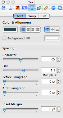
This will give you the opportunity to adjust the color, alignment, and placement of the copy in your selected text box. To adjust your font, highlight the text you'd like to adjust and click on the "fonts" button in the toolbar to choose from the fonts on your computer. It is best to use fonts that are commonly on most computers, like Times New Roman, Arial, etc. Using an obscure font will mean that if someone doesn't have that font on their computer, they will not be able to see the font that you chose.
If you want to insert text that is in a fancier font that most people viewing your website won't have on their computers, you can create a layout with your type in Photoshop or another image-editing program, and insert the file the same way you would a photo (see below). I did this using the Fling font that was used on the now defunct Blueprint magazine masthead.
3. Add images to your layout
I knew I wanted to use our wedding website to highlight some of the great engagement photos that our photographers, The Wiebners, had taken for us. Once I purchased some of the electronic files from them, I resized them in Photoshop to make them 72 dpi (which is ideal resolution for web images), and I saved them in an iPhoto album called "website photos" for easy accessibility. When I wanted to add a photo to my page layout, I clicked on the "media" button in my toolbar, found the image I wanted to insert, and simply dragged it onto my layout.
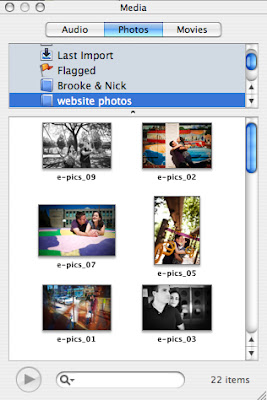
Once you drag an image into the layout, you can play around with the "mask" feature to crop the image to your liking, if you haven't already cropped it in a photo editing program like Photoshop.
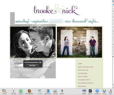
You might also have to go back to your "graphic inspector" window to turn off any borders that show up automatically when you drag your image in — this might happen depending on the default setting of the iWeb template you started with.
4. Add a navigation bar
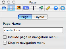
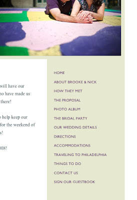
Obviously, your website is going to evolve as you go, but it's a good idea to at least create a placeholder for your navigation bar so you don't forget about it. Your iWeb template layout comes with a standard navigation bar, but it was not customizable and "pretty" enough for me, so I decided to turn it off in the "page inspector" window and add my own.
I started by inserting copy on top of the box I placed on the right side of my layout, with the names of the different pages I wanted to create. Later, I'll tell you how to link each of the page names to the correct page.
5. Duplicate your home page
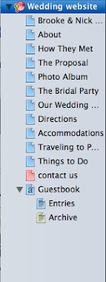
Once you are happy with how everything looks, make sure your page is selected on the left and go to "Edit > Duplicate" to duplicate your design. Rename your page to be whatever you'd like by double-clicking it in your page listing on the left. Then, simply edit the components of that page based on how you'd like it to look and any new content you would like it to include. You can do this as many times as you'd like to create all of your wedding website pages!
6. Create a guestbook
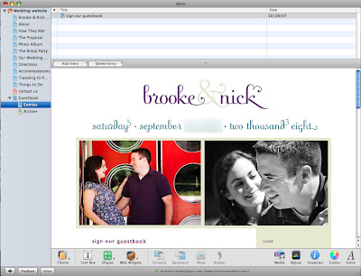
I was frustrated to find that there was no guestbook feature in iWeb, until I figured out that I could use the blog feature to create a makeshift guestbook. I went to "File > new page" and chose the "blog" page from the template I had been using. When the blog page showed up, I clicked on the "entries" sub-category in my page listing on the left, deleted all the components EXCEPT the main text boxes where the dummy blog copy was, and turned off the navigation menu in my "page inspector". (Leave the main "Blog" page alone for now, as you won't be linking to it for visitors to see.)
I adjusted the page size in my "page inspector > layout" to match the size of the rest of my pages. I then selected all of the components from one of my other pages (Apple A), copied them (Apple C), and pasted (Apple V) into the blog layout. I changed the name of my blog entry by double clicking on the "title" up top and writing simply "sign our guestbook." In place of the first entry, I put an intro paragraph ("Please leave a comment below to sign our guest book"), so every time someone leaves a comment it actually appears as a guest book entry.
7. Create links in your navigation bar
To link all of the pages in your navigation bar, begin on your home page; make sure that all of your pages are listed to your liking and in the order you'd like them to appear in. Individually select each page name, and go to "inspector > link inspector > hyperlink". Click on "enable as a hyperlink" and then "link to > one of my pages". A drop-down menu will appear with all of your page names, so you will select the page that you are linking to and make sure that "make hyperlinks active" is checked.
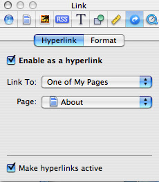
You can click on the "format" tab to customize the colors you'd like your links to be before/after they have been visited.
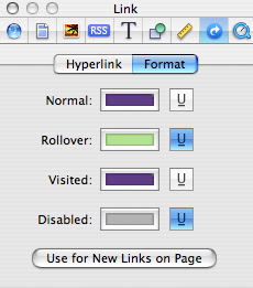
Do this for all of your page links on your home page; then, simply select the text box that has all of your navigation links in it, copy, and paste it into each page. When you paste, it should be in the same exact position on the page as it was on the page you are copying from. Now all of your links should work.
If you created the guest book page, you will want to link to your "entries" sub-page, NOT the main Blog/Guestbook page. By linking directly to the entries page, your comments will show up directly below your intro paragraph, rather than on another page, so it looks more like a real guest book.
8. Publish your site
I have a .Mac account, so I was able to publish my site to .Mac. I wanted our URL to be easy to remember (and not include my .Mac name), so I bought a domain name from Yahoo! and followed their easy instructions for hosting our site. Depending on your preference, there are several options for publishing your site when it is ready for the world to see.
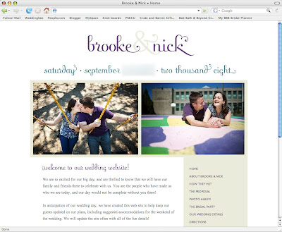
And that, ladies and gentlemen, is how to create a custom wedding website in iWeb! There are a lot more features to make use of, but I think once you master these you will find that everything else is simple.
I hope I haven't bored you too much, and I hope this information is actually useful to one or two of you :-) If you have any questions, please feel free to comment and I'll do my best to get back to you!
Weight-loss Plan for the OSB
.....Ya know, the OSB: Over-Scheduled Bride.
Yesterday, I ventured to the gym for the first time in about *cough, cough, static* months. What's that? You didn't hear me? Well, let's just say that the packed gym bag that has been living in my car all this time had a magazine in it which I had planned to read on the elliptical..... so when I finally got to the gym yesterday, I found myself reading about Thanksgiving dinner tips in late January.
Yup, it's been a while.
It's not that I'm lazy. It's that I've been so. damn. busy. that it's really hard to find time to get there. I know it's the classic excuse, but balancing a new job with wedding planning and trying to keep somewhat sane and connected with my loved ones has proven to be really, really hard. Getting to the gym isn't always the first thing on my list of things to do with my spare time. (Ha, sorry, I just hallucinated a little bit there and implied that I have spare time!)
But now, the wedding is less than 8 months away and there is no avoiding the fact that I need to get in shape. I'm not looking to lose an obscene amount of weight — I'm shooting for 8 pounds and a more toned bod — but if I don't start now, I'll just feel more pressure to get fit later on, when I'll likely have even more wedding chaos surrounding me. If I'm gonna do it, I've gotta start now, before the flab really takes over!
I know all you readers out there are uber busy bees.... what is your secret to finding time for fitness amidst your chaotic schedules? How do you fit it in with not much time and still see results? And what is your favorite activity — running with a friend, pilates, yoga? Share your secret!
Wednesday, January 23, 2008
A Hug or a Handshake?
I am sure that other's have felt the same awkwardness in similar situations, but sometimes I feel that I am particularly awkward and hesitant when it comes to one simple question: a hug or a handshake?
You know how it is..... you run into someone that you haven't seen in a while, maybe someone you're not particularly close to anymore.... you're caught off guard by running into them, and all of a sudden, you think, am I supposed to hug them? Do I stand here uncomfortably with my arms crossed and see if they initiate a hug? Do I just wave like a dork?
There are friends who I see often and immediately give a big bear-hug to every time I see them. I always give my parents a kiss on the cheek and a half-hug when I see them. Cousins, aunts, uncles, former roommates..... hug, hug, hug, hug. But when it comes to my wedding day, there will be a range of people making their way through the receiving line. There will be guests who are closer to Mr. Cupcake than they are to me, or some of his extended family members who I've only met a few times, or co-workers' spouses that I've made small-talk with here and there; I get strangely terrified at the thought of the awkwardness that could ensue. After all, there is nothing worse then reaching out for a handshake only to realize that the HSR (HandShake Recipient) is going in for the hug, making for a painfully uncomfortable back-patting debacle.
Will people feel shunned if I hug their significant other and go in for the handshake with them? Do I hug people I barely know? How do you classify your guests as "hug-worthy" vs. "handshake material"?
Does anyone else out there worry about this silly stuff like I do? Anyone????
Saturday, January 19, 2008
I'm a Blog Stalker
I have to come clean: I completely stalk my photographers' blog. Like, if blog restraining orders existed, I might be issued one and asked to stay 100 yards away from their blog at all times. There are not many days that go by that I don't check it out, hoping for some fabulous new photos to drool over. When there is nothing new going on, I'm a little bummed out, especially during this time of year when there might not be as many weddings taking place.
Well now, the Wiebners have really gone and done it.... they have made their blog even bigger and better and more fabulous. The photos are larger, there are more photos shown from each wedding, you can comment on posts, and you can rate your favorite photos as you scroll through them. The top 14 favorites are shown as thumbnails at the top of each page, so you can choose to check out what everyone is loving the most.
Check out all the exciting new features here! I especially love the shots from the New Years Eve wedding they shot (scroll over to page two once you're there).
I'll let you know when they give me my restraining order!
Momma Cupcake's Wedding invitations
You may have noticed that my posts have been a little sparse over the last few weeks, but I assure you it is with good reason: my mom, who is getting married next month, asked me to design her wedding invitations, and I happily obliged! Since the wedding isn't too far off, time was of the essence, so I had to put blogging on the back-burner for a little while.
Momma Cupcake and her fiance, George, are having a small ceremony and brunch reception with about 40 guests at Simon Pearce, a fantastic restaurant in the heart of Chester County, Pa., on the banks of the Brandywine River. The restaurant is named for the Irish glassblower of the same name, whose amazing glass designs (and that of his artisans) are found throughout the restaurant and its attached shop. You can also hang out on the first floor of the beautiful building and watch artisans creating their masterpieces — sometimes Mr. Cupcake and I will go if we're in the area just to sit and watch the glassblowers.
Momma Cupcake and George met at Simon Pearce on their first date six years ago (set up by mutual friends), and it is where they go to celebrate anniversaries and other special occasions, so it is the perfect place for their wedding. The ceremony will be held in a private dining room and the brunch reception will be held in the main restaurant area. This is a perfect, intimate place for a wedding with less than 50 guests!
Photos via simonpearce.com
Momma Cupcake and George wanted an invitation that wasn't too formal-looking but not overly casual, and they wanted it to convey the beautiful area surrounding Simon Pearce as well as the season. I decided to use some warm metallic-toned card stocks combined with a matte ivory stock for the invitation that create a nice (but not cold) wintry feeling. I used a tree motif in the bottom left and top right corners of the invitation to represent the rural Brandywine River area surrounding Simon Pearce. It took me a few days to pull together the design, and luckily Momma Cupcake is an ideal client who simply said "I love it! Print it!" and left me to it :-)
A day after I finished putting them all together, they were in the mail and the responses are already coming in! Sometimes, having less time to obsess makes brides get things done faster, I guess.... but I wouldn't know anything about that ;-)
Thursday, January 17, 2008
Venue Envy
Miss Hydrangea's post from the other day brought up the interesting point that a lot of brides, at least at first, tend to be opposed to the idea of having their wedding reception in a hotel ballroom. I guess the issue with hotel ballrooms is that they're seen as not as unique as all of the amazing spaces people are using for their receptions these days. Warehouses, historical homes, tented outdoor spaces, and art museums are all on the list of extraordinary venues. And, since we live in an age where it is not uncommon to feel pressure to come up with the coolest, hippest, newest ideas, hotels often fall into the "not as cool" category.
Brother Cupcake and his wife got married in June at the stunning Angel Orensanz Foundation in NYC. The structure was originally built as a synagogue in 1849, and was converted into an arts/event space in 1992.
Between the amazing venue and the personalized details, their wedding was nothing short of incredible, and I admittedly thought to myself "there is no way my wedding will ever be this cool!" That was alright with me, because they are two cool cats whom I expected would have nothing less than a spectacular and unique wedding, but I did feel a twinge of disappointment that I hadn't looked at some of the more chic and unconventional venues in Philly before choosing a hotel venue.
But then, I started to think of the pros and cons of my reception space, The Desmond Hotel, and I again came around to realizing how great it really is. I realized that The Desmond can be just as much of a blank canvas than any other venue, if I stay creative. It is also such a nice luxury to not have to search for a caterer or rental companies for linens, tables, chairs, etc. The bulk of what we need is included at The Desmond, so I can spend more time coming up with creative ways to make the space more unique.
Another main reason why I am so glad that we chose a hotel is that we don't have to worry about guests driving home after the wedding if they've had some drinks. A lot of our guests will be staying right at The Desmond, so we know they'll be safe, and we also don't have to worry about getting shuttles to transport people to an off-site location. To me, that peace of mind is worth the occasional venue envy, because it will still be beautiful and our guests will know that we tried to make things as convenient as possible for them.
Do you ever suffer from venue envy? How do you get over it?
Sunday, January 13, 2008
But it's not just a mixer....
It's the mixer. The KitchenAid Stand Mixer, that is!
Mr. Cupcake and I are still slowly adding things to our Bed, Bath & Beyond and Crate and Barrel gift registries, but this one item was a no-brainer. It is the Dalai Lama of all stand mixers. I am not exactly a chef, but I have always loved to bake and there's nothing like having a really good mixer to help you out. I miss using my mom's retro pea green mixer from the 70s now that I don't live at home anymore, and I'm really excited to have one of my own soon.
When we were out registering, Mr. Cupcake was allowed full control over the scanner gun (because he's still a little kid like that), but I wanted to personally scan my dream mixer myself, which he so graciously allowed. We originally registered for the 5-Quart Artisan Stand Mixer in Metallic Chrome, which is $299:
However, I was actually a tiny bit disappointed to find that it's not actually chrome like the Custom Metallic Stand Mixer, which is a whopping $499. I just couldn't justify registering for something that cost $200 more just because it looked prettier, though!
I decided that I'd be happier with our registry addition if I could spruce it up with a little color, and I love the pretty Ice blue:
I told Mr. Cupcake that I went ahead and changed the color choice on our registry, which he was fine with, but he then asked if in 20 years the color will be dated and uncool? I said it might be, but as weird as it sounds, I kind of like the fact that the pea green color of my mom's old mixer was a reminder that she had gotten it when she got married in the 70s. My kids might roll their eyes and say "Mom's mixer is so 2008," but they'll remember it, won't they? :-) Mr. Cupcake understood (or maybe just decided to smile and nod to make me happy), and the Ice blue mixer will soon be ours.
What was the one registry item that got you really excited?
Monday, January 7, 2008
"Her Mother and I Do"
Although I'm going a bit traditional and having both of my parents walk me down the aisle on my wedding day, I'm still not a big fan of the whole "who gives this woman" thing. I'm 27 — I'll be 28 by the time we get married — and I don't think I need to be "given away" by anyone. Our walk down the aisle will certainly mean a lot to me, but I feel that it is more symbolic of my love for my parents, their love for me, and their support of my relationship with Mr. Cupcake; it doesn't need to be translated into me being handed over like an object. I've been a pretty independent person since going away to college, and I have lived away from my parents entirely since I was 22. I like to think that I am my own person who can stand on her own two feet without anyone else having to support me.
This weekend, while catching up on some episodes of "Brothers & Sisters" on my DVR, I happened to catch the episode where Calista Flockhart and Rob Lowe's characters got married. After Sally Field walked her daughter down the aisle, the minister asked "who gives this woman?", to which Sally Field proudly replied, "she gives herself freely, with my love and support." What a perfect and appropriate reply for an independent woman of the twenty-first century!
I know it's only television, but I really liked this response, and it got me thinking about what I'd like my parents to say if asked this question during our ceremony. A response like this seems a lot more relevant in this day and age, and I think it reflects the free-thinking person my parents raised me to be.
What do you think? Stick with tradition, or get a little creative to make things more relevant to the era in which we live?
Saturday, January 5, 2008
Cry Me a River
If there is one thing that Mr. Cupcake needs to love and accept about me (because I will never change), it's that I cry. A lot. A bit more than even the most hormonal average person, I think. Sometimes I cry because I've been running myself ragged and something sets me off, like spilling something on a favorite shirt. Sometimes I cry if I'm upset about something happening in my or someone else's life that I can't control.
My tears don't always come as a result of feeling sad or upset, though — I often cry out of happiness, like if someone gives me a really unexpected and generous gift that I'm touched by. I also cry when I hear a moving story of overcoming great odds, or when watching a movie with a sweet ending. I am a little ashamed to admit this, but I pretty much always, always cry when watching any episode of Made on MTV. (You have to admit that some of those kids really turn their lives around and learn great life lessons! At least, that's what I tell myself while watching in order to avoid feeling completely pathetic during a sobfest.) I still cry every time I watch Love Actually, especially when the little boy Sam calls his stepfather "dad" after he has victoriously talked to (and gotten a kiss from) the love of his life. I cry when I simply hear the opening credits to Steel Magnolias, because I know what I'm in for. I can't always explain it, but some things just "get" me.
As a result of my tearful reputation, it is pretty much a given that I will break out into the "ugly cry" at least once on my wedding day, and I'm not ruling out two or three times. I'm sure additional less ugly tears will make an appearance as well. Luckily we live in the age of waterproof mascara and airbrushed makeup that can hopefully outlast my tears on the big day, but my biggest worry is that I will have red, bloodshot eyes for the rest of the day.
I wear contact lenses, so my eyes are already prone to redness. I've used eye drops in the past which have made my eyes not feel as dry after a long day with my contacts in, but the redness never really goes away. It would be nice to not be a bloodshot-eyed-bride, so I'd like to find something that is suitable for contact lens wearers that can take away the redness that will result from the crying.
Visine "gets the red out," as they say, but Visine for Contacts mentions only lubricating and clearing my lenses, without the famous slogan. As a contact lens wearing bride, am I destined to be stuck with red eyes? Will using regular Visine irritate my contacts at all?
Do any of you contact-wearers have a solution to my irritated eyes?
Finding inspiration where you'd least expect
I have found that there is often better inspiration for wedding decor in magazines and on websites that are not intended to be wedding-related resources. I recently paged through an old (July 2007) issue of Real Simple magazine and found this lovely idea for displaying candles with a table centerpiece:
I love how the cake stand adds importance to the candles, and I love how it is an unexpected way of displaying them. What a cool centerpiece this would create, without needing any flowers at all.
Since I already have my cut glass candle-holder idea in the works, I thought that maybe a cake stand would be an interesting pedestal for a small flower arrangement in the middle of each candle grouping. It would still keep the flowers low (so guests can see each other across the table), but it would add a nice level to spice things up a bit.
For a wedding like ours that will have between 175-200 guests, I wasn't sure that finding upwards of 20 cake stands would be realistic for each table centerpiece, without breaking the bank. However, my mom and I met with our first florist option today, and lo and behold there was a cake stand with three small vases on top of it in one of their display areas. Once we talked about it and discussed my overall vision, it was clear to me that I wouldn't be able to let the cake stand idea go!
Having the cake stands as pedestals for the small floral arrangements would add a bit more cost to things, but not nearly as much as we expected, and I think the end result would be worth it. Plus, if I find them for a lower price than what the florist is offering, I can buy them myself. Either way, I would own the cake stands after the wedding is over, so I can try to sell them (perhaps to another bride with the same idea!).
Have you found anything to add to your reception decor that strays from its intended use?
Hooray for free samples!
No, I'm not talking about the little free samples of strange concoctions at the grocery store.... free paper samples! My favorite kind!
I recently found some pocket-folds on paperpresentation.com that I'm thinking about using for our save-the-dates. The pockets they offer are a good price, and there is a nice range of colors and styles. When I was perusing the website to find a place to order samples, I couldn't find any such information. Most of these paper websites offer samples, but they typically run from $5-$7 per sample, which can get a little pricey if you are comparing several colors, styles, etc.
I proceeded to use the handy dandy "contact us" link and emailed the Paper Presentation folks to see if I could get a sample or two. They wrote back to tell me that I could get up to FIVE samples, at no charge! Unheard of! Exactly six days later, I received the five different samples I ordered, in an envelope with $2 worth of postage. And I didn't have to pay a penny.
Yay for vendors who realize that treating customers well from the beginning will pay off later on!
Another bonus about Paper Presentation is that they guarantee satisfaction with their products, and if you're not satisfied you can return them within 60 days.
Have you found any other vendors out there (paper or non-paper) that offer free samples for your convenience? Share 'em with the hive!
Friday, January 4, 2008
Color, Revisited
You may recall my confusion over choosing a color palette. Over the ten (eek!) months that we've been engaged, I have gone through countless color schemes. When I look at some of the images I bookmarked months ago, I wonder, what was I thinking??? I have changed my mind more times than any bride should, and I've been a little nervous to commit to a new palette for fear that I will just change my mind again. Now that we're getting closer to the crucial time of color-based decisions (save-the-dates, flowers, etc.), it's a little scary to think that I have to stay firm in my decision. Not that the wedding-color-feds will come and get me if I change my mind, but I'd like things to stay fairly consistent once our guests have seen the save-the-dates.
The teal bridesmaid's dresses are a huge color-based decision which ended up leading me in a new direction for my palette, and, dare I say it, I think I have a winner.
Drumroll please.... The chosen colors: teal and chartreuse. Hive, I now give you.... my revised inspiration board:
There are some noticeable differences between this board and my original board — the main one being that there is no longer any purple. Something about the purple was bugging me, and once I started to focus only on teal and chartreuse, it all came together. It is the unexpected and uncommon combo that I had been searching for, while also including two colors that I am often drawn to in the rest of my non-wedding-related life. It leaves room for me to add some small splashes of other blue or green hues so things don't get too matchy-matchy, and I'm thinking of adding just the smallest dash of raspberry in the flowers (since I'm guessing there aren't a lot of teal flowers out there, and I don't want to only have white flowers with greens).
I think this palette is the perfect accent to my "vintage charm meets modern whimsy" look (if I do say so myself!). It definitely leans more toward the modern side of things, and I like that it will be a fresh juxtaposition with the other vintage-inspired details (like my dress, or our cut glass centerpieces).
Do you like where I have ended up after my color conundrum? How many color revisions have you gone through before you were satisfied?
The teal bridesmaid's dresses are a huge color-based decision which ended up leading me in a new direction for my palette, and, dare I say it, I think I have a winner.
Drumroll please.... The chosen colors: teal and chartreuse. Hive, I now give you.... my revised inspiration board:
Click on image to enlarge
Sources: (top row) tables via Social Design; teal bridesmaid's dress style D328 via Alfred Sung; photo booth source unknown; (second row) plume invitation via Louella Press; my dress style 1860 via Casablanca bridal; vintage wrangler invitation via Louella Press; (third row) blue purse via theknot.com; calligraphy via Papermints; table setting via theknot.com; (fourth row) flowers via theknot.com; cut glass candles via PerfectBound; stationery via theknot.com; flowers via theknot.com; (fifth row) vintage buttons via eBay (seller unknown); centerpieces via theknot.com.
There are some noticeable differences between this board and my original board — the main one being that there is no longer any purple. Something about the purple was bugging me, and once I started to focus only on teal and chartreuse, it all came together. It is the unexpected and uncommon combo that I had been searching for, while also including two colors that I am often drawn to in the rest of my non-wedding-related life. It leaves room for me to add some small splashes of other blue or green hues so things don't get too matchy-matchy, and I'm thinking of adding just the smallest dash of raspberry in the flowers (since I'm guessing there aren't a lot of teal flowers out there, and I don't want to only have white flowers with greens).
I think this palette is the perfect accent to my "vintage charm meets modern whimsy" look (if I do say so myself!). It definitely leans more toward the modern side of things, and I like that it will be a fresh juxtaposition with the other vintage-inspired details (like my dress, or our cut glass centerpieces).
Do you like where I have ended up after my color conundrum? How many color revisions have you gone through before you were satisfied?
Wednesday, January 2, 2008
Dishing it Out
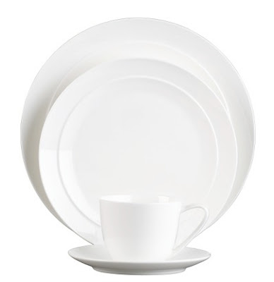
On New Year's Eve day, Mr. Cupcake and I took advantage of having the day off of work to begin our registry at Crate and Barrel. We had started a registry at Bed, Bath & Beyond a few months ago, but were hoping to find dinnerware and flatware at Crate and Barrel that suited our taste more. We were immediately drawn to two patterns at C&B:
We both were drawn to the light pattern on the Celadon design, as it adds a little interest without being too loud. I also like the simplicity of the shapes, and I like that the pieces aren't too heavy or clunky.
We were also debating on the Halo design, since it is a bit more practical in its simplicity. We like the subtle lip along the outside of the plates that isn't too wide. Although I'm usually someone who is drawn towards color and patterns, I wanted some everyday dishes that won't seem dated in a few years, and won't necessarily dictate whatever else we decide to put on our table over the years.
After a LOT of back-and-forth, we ultimately decided to go with the Halo design. When we got home after our excursion, though, we started to second-guess if the Halo dinnerware is meant for everyday use, or if it is intended for use as fine china. It is listed under "bone china" on the Crate and Barrel website, and there is no real distinction between everyday or special occasion dinnerware.
What do you think? Does it work as everyday dinnerware? Or should we find something more casual to use on a daily basis?
"Three Weddings and a New Job," starring Miss Cupcake
Planning a wedding forces us to prepare for the changes ahead; it brings to the forefront many emotions and family issues (the good, the bad and the ugly) that give us a glimpse into what lies ahead. Sometimes it's also a little startling to think of the adjustments we may have to make in the future, and it's all a little overwhelming at times.
I have not necessarily been the kind of person to always embrace change: I am a creature of habit who orders the same thing all the time in restaurants, I get emotionally attached to things like pillows and phone numbers, and it usually takes me several months to commit to getting a new hairstyle (and then no one even notices that it's new because it's so close to the old one). I am, by no means, one of those people who could up and move a thousand miles away just for the sake of "change."
Lately, however, so many amazing changes have been occurring in my life and within my family that I am starting to actually look forward to change. As the title of my post may suggest, it has been quite a whirlwind several months for me and my family:
1.) Brother Cupcake, who is four years my senior and my only sibling, got married to fabulous sister-in-law Cupcake in June. They had been together for.... longer than I can remember ;-), and it was such a touching day to see my brother join in marriage with such a wonderful woman. (I get a little verklempt just thinking about it!)
2.) My spectacular mother, whose spectacularness I could never sum up in a million words, is getting married! She and my dad got divorced when I was ten, and she dated a bit here and there over the years, but six years ago she met an amazing man who has since really become a part of our family. They had been talking about making it official for a little while, and I asked her about this over Thanksgiving, but she said they thought they'd wait until after my wedding. I said, why wait?????? Go for it! Maybe not all brides would feel this way, but it is so wonderful to see my mother happy and in love, and I didn't want them to feel like they had to wait on account of me and Mr. Cupcake (after all, we don't own the entire year of our wedding, do we?). I knew it would be something small and tasteful, and they talked it over and decided to get married this February. We are so, so excited for them, and thrilled to be officially gaining a new member of the family.
3.) Mr. Cupcake and I are getting married! (Okay, so this one's pretty obvious!) Sometimes it still surprises me that I'm "allowed" to get married. I don't always feel like an actual adult who can handle such responsibilities, but then Mr. Cupcake and I will be talking about the bills or swooning over flatware to add to our registry, and it hits me: yup, I'm a grown-up alright! Adjusting to the changes of living with someone and talking about what our "forever" is going to hold has certainly been something new, but it has been fun and eye-opening, and it makes me look forward to even more changes that we can make together.
4.) In October, I started a new job at a place that has been a complete change of pace from my last job (which sometimes bored me to tears). And just this week, I started a new position within the same company, so I'm essentially starting my second job after only three months of doing the first one! I'm not going to lie: it has been a little challenging to not lose my mind over learning new systems and meeting new people in addition to trying to plan a wedding, but it has actually been quite a welcome change. I may have abandoned a few things on my wedding "to-do" list for November and December, but it has been worth it to come home feeling happy and fulfilled at the end of the day. Mr. Cupcake has certainly noticed a positive change in my mood, so I think he'll ultimately be marrying a happier Miss Cupcake when the day comes :-)
So, in case you lost count, that's three weddings and a new job, all in the span of 15 months. It might have been too much for the old Miss Cupcake to handle, but these are the kind of changes I have come to welcome and embrace.
How have you dealt with the changes of looking ahead to becoming a wife, amidst all the other uncontrollable changes happening around you?
Subscribe to:
Posts (Atom)